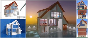
After years of printing presentation boards for our clients in the architecture and engineering fields, we know how important they are. The presentation and the selling of your concept are the most crucial parts of the design process. After all the time you have put into your concept, you want to make sure that your design stands out from the rest.
Before you start designing your presentation board, here are some tips to make sure your design outshines the rest.
- Structure – Your presentation board should be designed with importance in mind. What should observers know and see first. 1) Perspective view that shows off the design best. This should be the biggest image on your board. If you can, make the image bleed on two or three sides. 2) Concise statement that tells them about the features and benefits of your design. Pretty much the sales pitch of your design. 3) Front, top, and side views of the Floor Plan. 4) Include at least two elevation views. 5) Hand drawings to demonstrate how the design came to be.
- Background – Use a plain background color, nothing fancy or patterned. Solid white or gray are great for backgrounds. The background should be plain to allow the observers’ focus to be drawn to the content rather than the background.
- Font – Pick one font. There is no need to have different fonts used for different portions of your board. Instead, use the same font but at different sizes to create a visual hierarchy. Make the title the largest size font, and then your informational sentences or captions smaller. Choose a font that is simple and legible. Script and writing fonts are not suitable for presentation boards. Like the background, remember to keep the color simple by using black or a dark gray.
- Text Copy – Any text on your board should be short and sweet. Only one or two key sentences need to be added as part of the “architect’s statement”. Captions under images and illustrations are fine, again as long as they are short and sweet. Remember this is a presentation board – it is a VISUAL tool. Do not let your board do the explaining. If you need to elaborate, do so during your oral presentation.
- Sketches – Include a few small sketches of the concept and how your design developed along the way. People are intrigued to see how you developed your idea and how the first sketch transformed into the amazing design that you are presenting.
- Your Name – Do not forget to include your name on your board. Typically names are placed in the bottom right hand corner. If you have more than one board, be sure your name is on all of them.
- Negative Space – Be sure to leave some free, empty space on your board. There is no need to cover every inch of the board with images, sketches, or text. Remember quality over quantity. The negative space on your board allows the viewer to not be overwhelmed and ease into viewing your board.
- Research – Do your research and look at others’ work. Jot down what you like and don’t like about other boards. This will give you a great idea of what you want your board to look like. Remember to show your creativity through the boards as well. Try not to replicate another’s board, even if you like everything about it.
- Time – Do not wait until last minute to start designing your board. Rushed work is usually never good work, and definitely not great work. Try to map out a schedule of what you want to accomplish each day, or how far along your board should be. Cushion your timeline too, just in case something pops up that you can’t control.
- Design Programs– Use a program that you are comfortable with and know how to use efficiently. If you are not familiar with any design programs, find someone who can teach you and who uses a particular program often.
- Do Not – Do not create your board manually. This means no writing, no gluing or pasting – nothing by hand! Your board will end up looking like a collage rather than the presentation it should.
When your presentation board design is complete, give Avalon a call. We would be more than happy to print your board for you!
If you liked this blog you might also be interested in reading: Graphic Design Tips for Beginners
References:
http://falihinjasmy.blogspot.com/2011/04/tips-on-how-to-make-better-presentation.html
http://visscom.wordpress.com/2013/04/14/presentation-board-layout-tips/
Download our free case study to see why having a backup plan can save your backside.


