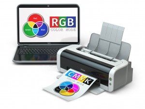
After years in the printing industry, we have heard the same question over and over: “Why are the colors on my computer screen different from the colors on the printed piece?”
Unfortunately, there is no cookie cutter answer to this frustrating issue. There are many variables that play a role in the color variation from your monitor to the printed piece. While we could take hours to explain the differences, displayed below are several reasons why color matching for printed pieces should not be compared to an image on a monitor. Request a printed or press proof to get a true color match. Using Pantone colors can also help with color matching.

Before we move forward, it is important that you understand the various color models that exist. Color models by definition are abstract mathematical models describing the way colors can be represented as groups of numbers. First we have the RGB or Red, Green and Blue color model that’s main purpose is for the sensing, representation, and display of images in electronic systems such as televisions and computers.
Second we the have CMYK color model which stands for Cyan, Magenta, Yellow, and Black. The CMYK model is used in color printing, and is also used to describe the printing process itself. CMYK refers to the four inks used in some color printing. The “K” in CMYK stands for key because in four-color printing, cyan, magenta, and yellow printing plates are carefully keyed, or aligned, with the key of the black key plate.
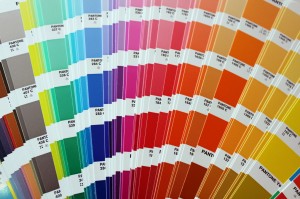
Lastly we have the Pantone Matching System (PMS). PMS or “spot colors” are composed of nine basic colors, including white. From the specific combination of these nine colors, PMS can produce over 700 exact colors. The PMS color model can only be used in offset/press printing and is typically used when printing business cards, envelopes, and letterhead.
So why do the colors on your monitor look different than on paper?
1) White-Point Mismatch – Test this out! Take a blank piece of paper from your printer and hold it up beside your computer screen. I am guessing that the white color of the paper does not match that of the screen. There is actually a pretty good chance that the paper looks yellow and the screen has a blue tint. This is referred to as white point mismatch. If you see the variance with white, the same expectations should be held to color when printing.
Computers monitors produce white by setting the RGB values to 255,255,255. The white on a monitor can vary from a warm yellow-red color to a cool blue color. Paper, on the other hand, is very dependent on the color of light illuminating it. Papers have their own color as well, but nothing affects them more that the light you have in your work area. Just as difficult as selecting a white when painting a wall, the same can be said for the many versions of white available for paper. The white can depend on the brand, the finish of the stock, and the light in the room.
2) RGB vs. CMYK – When you print on an inkjet or laser printer, or send your work to a commercial printer, your materials are likely going to be created using CMYK process printing or “four-color printing.” Combined, these four inks produce the illusion of a full range of colors on the printed page, but the image is actually only composed of four colors.
Monitors on the other hand, do not display CMYK colors, but rather RGB colors. Monitors can display millions of colors, producing a richness of color. The RGB color system display a much wider range of colors than CMYK printing. The RGB System is also used in most cameras to show an extremely close version of reality on screen. This is also known as transilluminated display where the colored light shines out from the screen. Transilluminated images deliver a much greater range of contrast and color intensity than images printed on opaque paper.
Moral of the story is that the colors displayed on your monitor are not consistent. You can view the same file on two different computers and see two different colors. Each device renders color differently. Also take note that some on-screen colors are very challenging to convert to CMYK and replicate with digital printing. The colors as they appear after you print on your home or office printer are probably more accurate than your computer monitor, but still not that accurate.We recommend that wherever you are going to have your piece printed, you should print a hard copy proof to match with your expectations.
What can you do about this issue?
#1 – If you are particular on your logo colors and need them to be as accurate as possible, the best option would be to build your piece using the Pantone Matching System. In all honesty, any project where your brand identity is of utmost importance, PMS colors should be used. Unfortunately, because the inks are premixed and can only be used on one job at a time, printing can be expensive for small quantity print runs.

#2 – If you decide not to print using the Pantone Matching System, digital printing is a great alternative. In digital printing, as explained above, exact color matching is not possible. With new technology constantly coming to market, digital printing can get very close to PMS matching. However, variation can arise from one run to another by a few shades – even if the exact print settings are used.
Another benefit is that most printers and graphic designers have a Pantone Color Bridge swatch book that you can reference to get close to your desired color. The swatch book will show you the Pantone ink colors right beside their closest match in the CMYK digital printing spectrum. This will provide your graphic designer and/or printer with a reference when designing or printing your artwork or marketing piece. If you have an experienced graphic designer and a great printer – whether at your office or a printer vendor – your final printed piece should be close to what you envisioned during the design phase. Producing a hard copy proof is truly the best way to ensure color matching and match the end product with project expectations. Merely seeing a PDF proof on a monitor may not yield the same expectations as we have shown above in this article.
Hopefully, this gave you some insight into the issue of the color variation between your monitor and your final printed piece. If you have questions, do not hesitate to call your local Avalon office. As we said before, since our inception we have heard this same question repetitively and will work with you to get you the color you desire whether you are using the Pantone or CMYK systems.
If you liked this blog you might also be interested in reading: Digital vs. Offset Printing – Which is Better for Your Project?
Learn how Avalon’s secure print and mail services allow you to focus on the bigger picture.


